What a brand kit is and why every company needs one
The logo looks different on the website than on Facebook, the invoice has different colors than the flyer and every employee uses a different shade. Sounds familiar? The solution is a brand kit. Let us explain what it is, what it contains and why every company that takes its brand seriously needs one.
What a brand kit is
A brand kit (brand manual or visual identity) is a set of rules and elements that define how a company should look and feel to the outside. It is a single source of truth from which the website, business cards, social media posts and ads are created, so that everything looks unified and professional.
Simply put, a brand kit ensures that your company looks the same and recognizable everywhere, regardless of who creates something for it and where.
What a brand kit contains
Logo and its variants
The foundation of every brand kit. It includes various versions of the logo (color, black and white, on light and dark backgrounds), the minimum size and the clear space around it. It usually also includes clear rules on what must not be done with the logo.
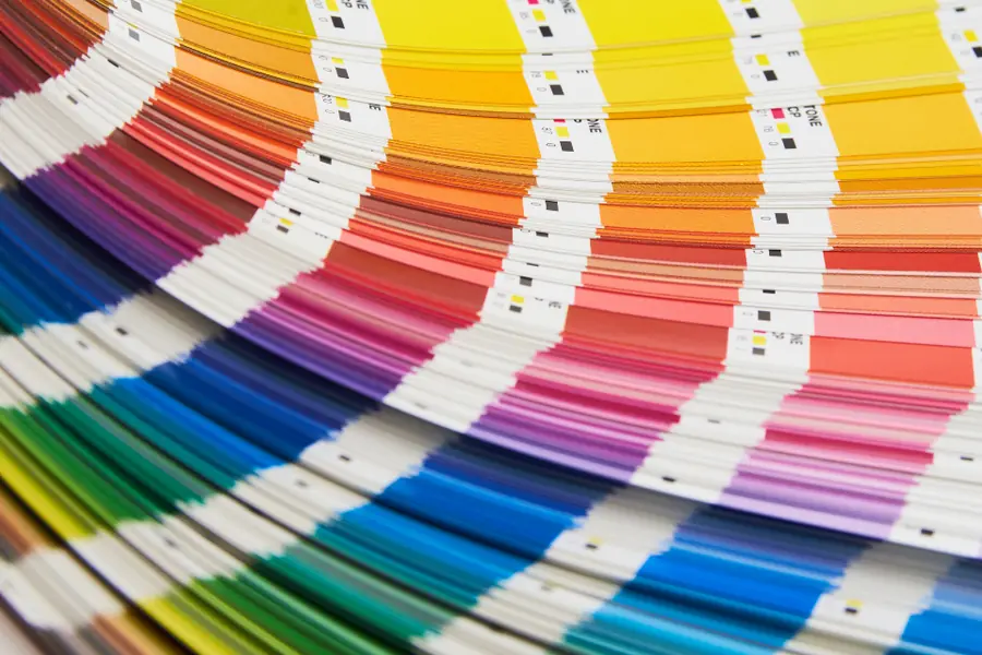
Colors with exact codes
This is key. The brand kit defines the company colors with their exact codes (for example HEX and RGB), so the shade is always identical on the website, in documents and in print. Without codes, unpleasant deviations arise and the brand looks unprofessional.
If you are still looking for a suitable color palette, the free ePulz.io brand kit generator helps, generating a matching palette from a color or an existing website, including harmonies and contrast-safe text combinations (according to the WCAG accessibility rules).
Typography (fonts)
The brand kit defines what font is used for headings and what for body text, including sizes and weights. Unified typography significantly increases readability and the professional impression.
Imagery style
Which photos and graphics fit the brand: style, color, atmosphere. Thanks to this, visuals look consistent, not like a random mix.
Tone of communication
Not only the look, but also how the company speaks: formally or in a friendly way, briefly or in detail. A unified tone builds the brand’s personality.
Why a company needs it
- Consistency. Everything (website, social media, print, email) looks like one whole.
- A professional impression. A consistent brand looks trustworthy and established.
- Faster work. A graphic designer, printer and employees have clear rules and do not guess what color or font to use.
- Brand protection. It prevents everyone from adjusting the logo and colors their own way.
- Memorability. People remember a consistent look and associate it with you.
Where a brand kit is used
A brand kit is not a document for a drawer, it is used every day:
- The website and e-shop, where the brand makes the first impression, related to the article on how to build a quality website or e-shop.
- Social media, where consistent posts build the brand, more in the article on when to post.
- Digital screens (digital signage) in stores and receptions.
- Print, business cards, flyers, vehicle wraps, packaging.
- Documents and emails, invoices, quotes, signatures.
It is exactly the consistent presentation across all these channels that makes a brand strong and trustworthy.
Conclusion
A brand kit is the foundation of a professional brand. It unifies the logo, colors, font and communication, saves time and builds trust. For every company that wants to look serious and recognizable, it is an investment that pays back with every customer contact.
Want a unified and professional look for your company across web, social media and print? Get in touch, we will prepare a brand kit and its deployment to measure.
This article is part of our Business and IT overview.
Need help with IT?
We will take care of your computers, networks and security - for businesses and households in the Liptov region.
Contact us